- VStack: A view that arranges its subviews in a vertical line.
- HStack: A view that arranges its subviews in a horizontal line.
- ZStack: A view that overlays its subviews, aligning them in both axes.
VStack
 1
 2
 3
 4
 5
 6
 7
 8
 9
10
11
12
13
14
15
16
|
var body: some View {
VStack {
RoundedRectangle(cornerRadius: 35)
.foregroundColor(.orange)
.frame(width: 100, height: 100)
RoundedRectangle(cornerRadius: 35)
.foregroundColor(.green)
.frame(width: 100, height: 100)
RoundedRectangle(cornerRadius: 35)
.foregroundColor(.cyan)
.frame(width: 100, height: 100)
}
}
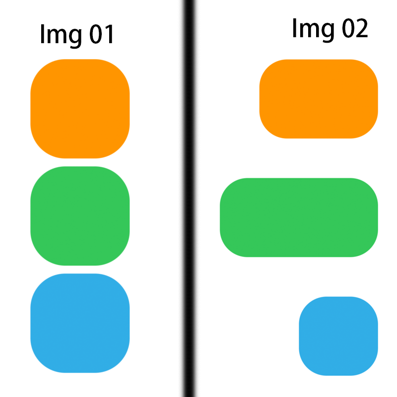
// Please see the Effect: Img 01
|
| Effect |
 |
 1
 2
 3
 4
 5
 6
 7
 8
 9
10
11
12
13
14
15
16
|
// Please see the Effect: Img 02
var body: some View {
    VStack(alignment:.trailing, spacing: 50) {
        RoundedRectangle(cornerRadius: 35)
          .foregroundColor(.orange)
          .frame(width: 150, height: 100)

        RoundedRectangle(cornerRadius: 35)
            .foregroundColor(.green)
            .frame(width: 200, height: 100)

        RoundedRectangle(cornerRadius: 35)
            .foregroundColor(.cyan)
            .frame(width: 100, height: 100)
    }
}
|
If the frame of the VStack is not set, the VStack will calculate its own size according to the size of the element.
We can see that the width of the VStack is equal to the width of the widest rectangle, and the height is equal to the height of 3 rectangles plus the size of spacing. (Effect: Img 03)
 1
 2
 3
 4
 5
 6
 7
 8
 9
10
11
12
13
14
15
16
17
|
// (Effect: Img 03)
var body: some View {
    VStack(alignment:.trailing, spacing: 50) {
        RoundedRectangle(cornerRadius: 35)
          .foregroundColor(.orange)
          .frame(width: 150, height: 100)

        RoundedRectangle(cornerRadius: 35)
            .foregroundColor(.green)
            .frame(width: 200, height: 100)

        RoundedRectangle(cornerRadius: 35)
            .foregroundColor(.cyan)
            .frame(width: 100, height: 100)
    }
    .background(Color.indigo)
}
|
| Effect |
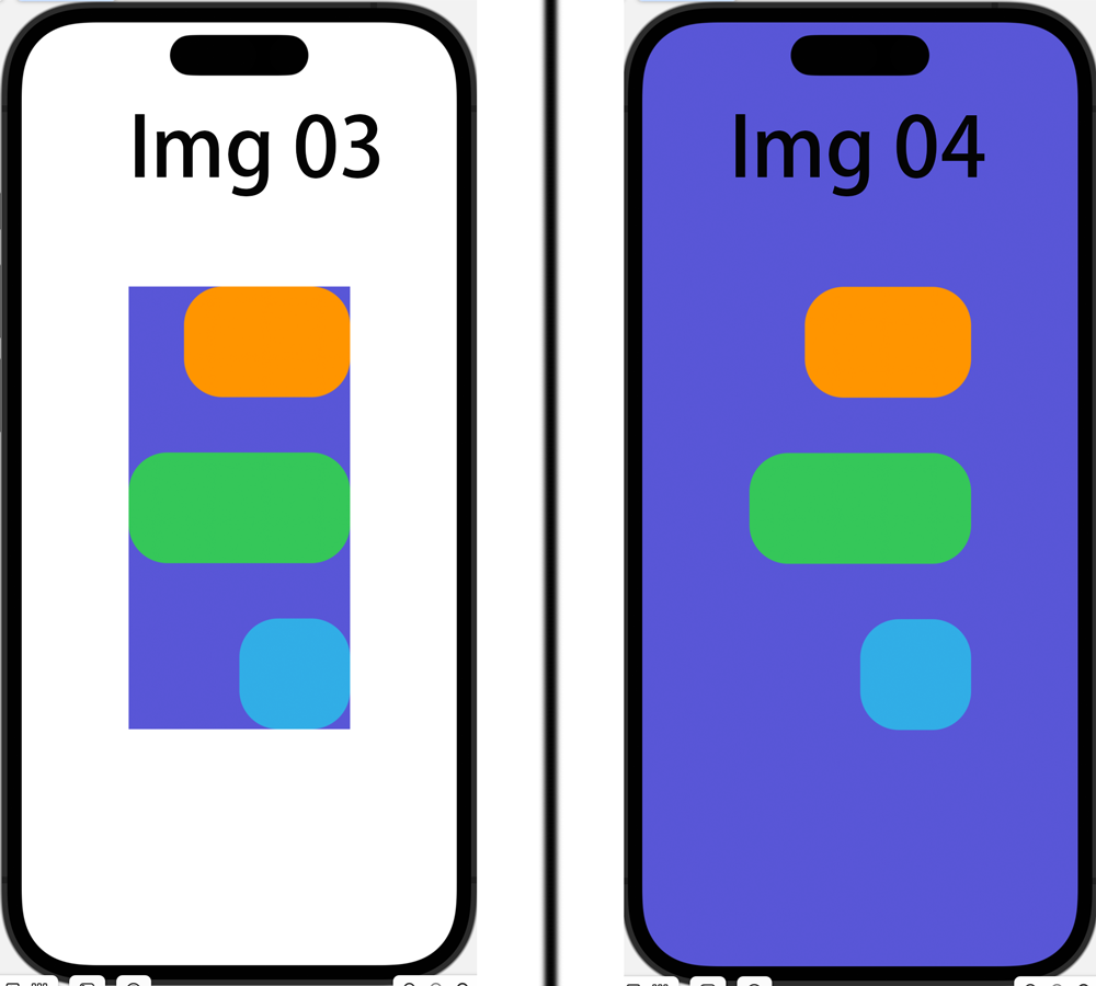 |
We can make the VStack size equal to the size of the parent node by setting the frame’s maxWidth and maxHeight to infinity. (Effect: Img 04)
 1
 2
 3
 4
 5
 6
 7
 8
 9
10
11
12
13
14
15
16
17
18
|
// (Effect: Img 04)
var body: some View {
    VStack(alignment:.trailing, spacing: 50) {
        RoundedRectangle(cornerRadius: 35)
          .foregroundColor(.orange)
          .frame(width: 150, height: 100)

        RoundedRectangle(cornerRadius: 35)
            .foregroundColor(.green)
            .frame(width: 200, height: 100)

        RoundedRectangle(cornerRadius: 35)
            .foregroundColor(.cyan)
            .frame(width: 100, height: 100)
    }
    .frame(maxWidth:.infinity, maxHeight: .infinity)
    .background(Color.indigo)
}
|
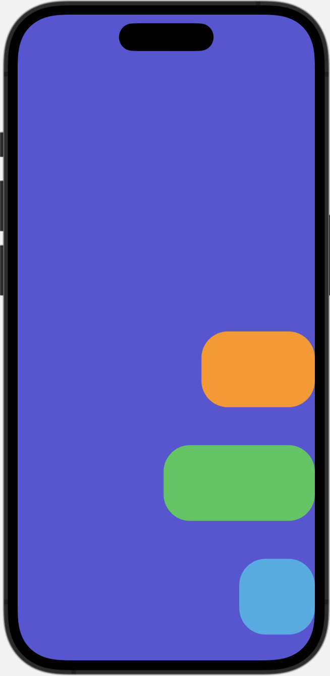
Set the frame and also set the alignment to control the position of the child elements in the VStack. And if you found the view withe the boundary, you can by setting edgesIgnoringSafeArea, the layout can be extended to the safe area area.
 1
 2
 3
 4
 5
 6
 7
 8
 9
10
11
12
13
14
15
16
17
|
var body: some View {
    VStack(alignment:.trailing, spacing: 50) {
        RoundedRectangle(cornerRadius: 35)
          .foregroundColor(.orange)
          .frame(width: 150, height: 100)

        RoundedRectangle(cornerRadius: 35)
            .foregroundColor(.green)
            .frame(width: 200, height: 100)

        RoundedRectangle(cornerRadius: 35)
            .foregroundColor(.cyan)
            .frame(width: 100, height: 100)
    }
    .frame(maxWidth:.infinity, maxHeight: .infinity, alignment: .bottomTrailing)
    .background(Color.indigo)
}
|
| Effect |
 |
HStack & ZStack
HStack and ZStack and VStack are only in different directions. The other usages are basically the same as VStack.
HStack is arranged horizontally.
ZStack is stacked on the Z axis.